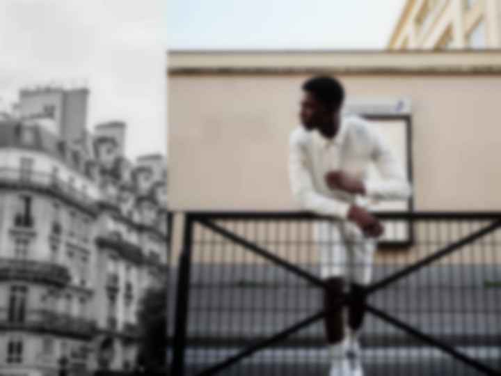
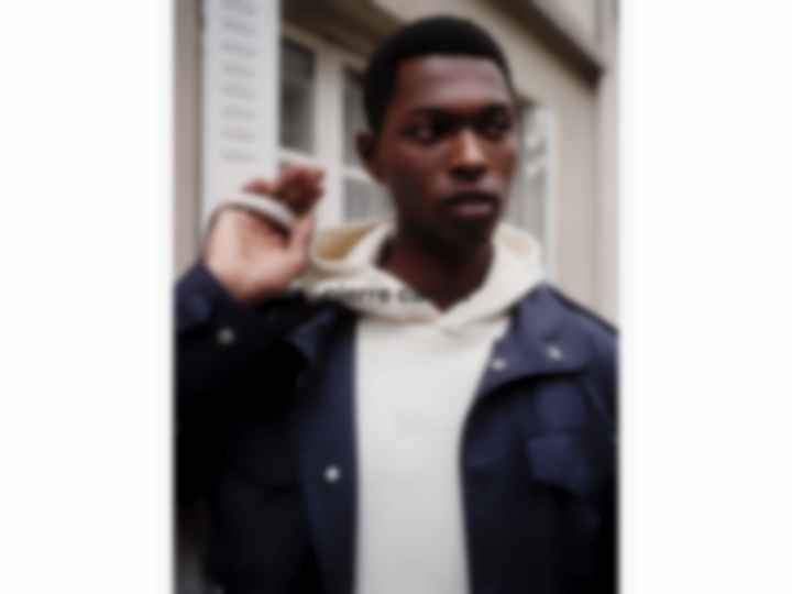
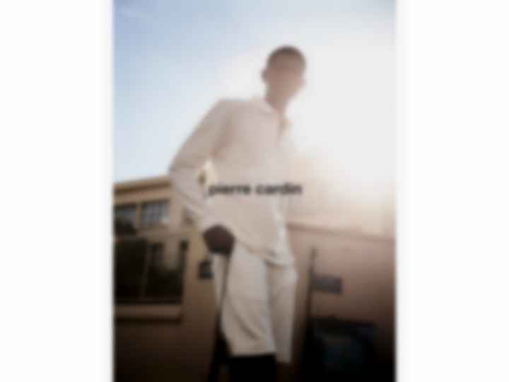
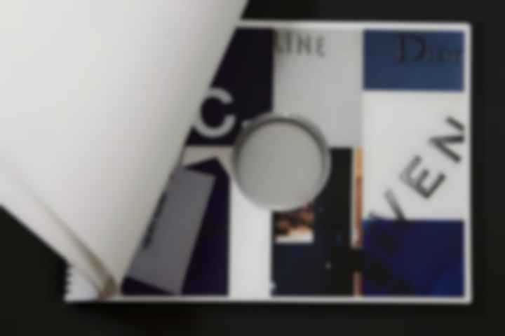
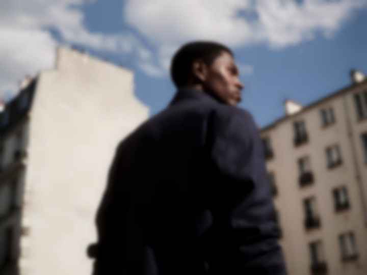
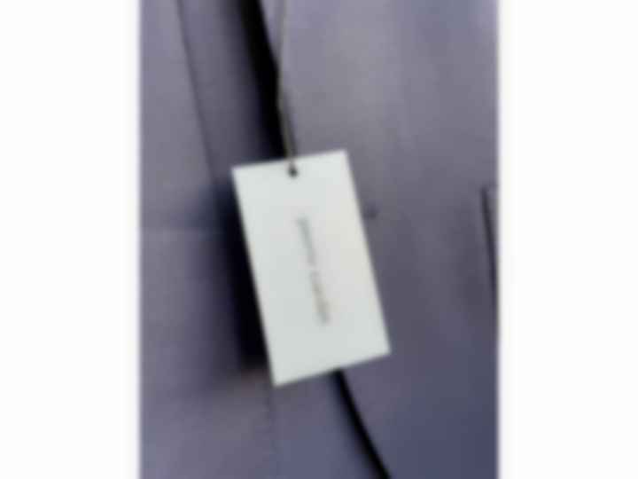
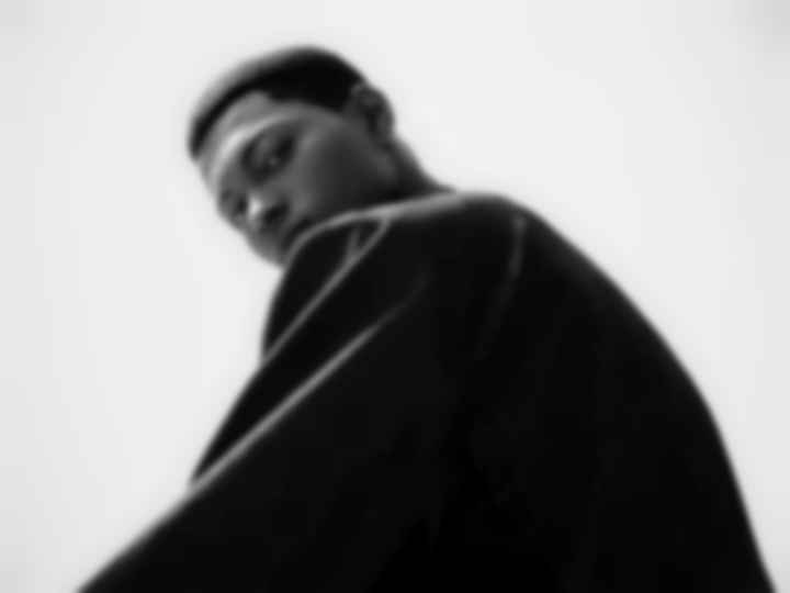
„Liberté & Facilité“ – CARDIN Relaunch
In 2021, OFFICINA developed a new Brand Identity Design for PIERRE CARDIN. Our aim was to create a design language mirroring the French heritage of the brand, as well as reflecting a new expression of the brand statement „Liberté & Facilité“ in the visual communication. Therefore, we modified the logo, refined the brand icon and selected a new lead typeface and color scheme.
In revising and reinventing the creative message in the visual design, we dissected the brands appearance as a whole, identified essentials, set focus topics and refined their narratives.
In our concept, we outlined how to sharpen visual brand communication across all channels – from brand identity design to product labeling and in the webshop. We presented a concept sketch aimed at elevating the brand experience through a comprehensive 360-degree communication strategy, focusing on high density and clarity.
CARDIN Relaunch
Strategy & Visual Communication
Brand Identity Design
ECOM Redesign
Labeling Redesign
Client: Ahlers GmbH, 2021/2022
#000000
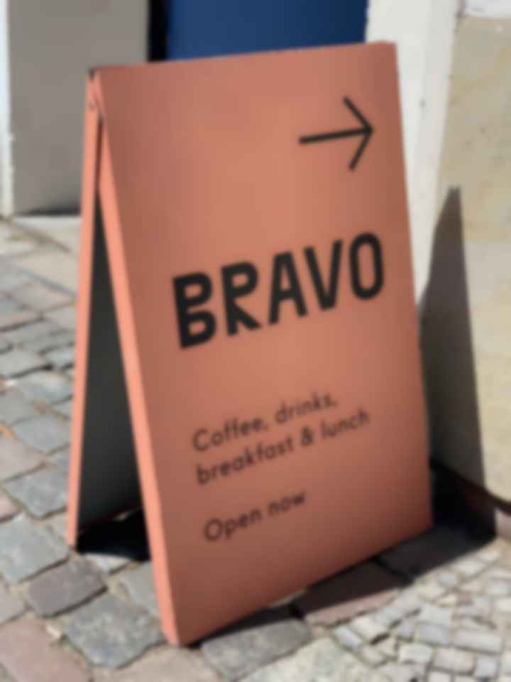
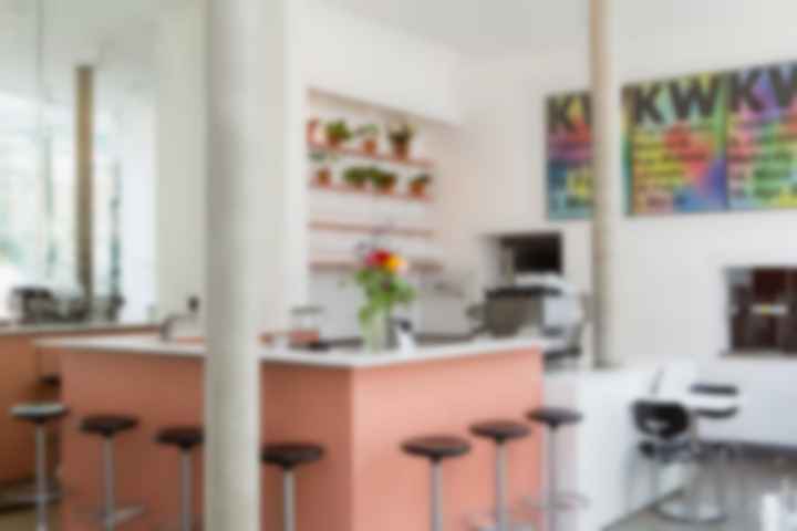
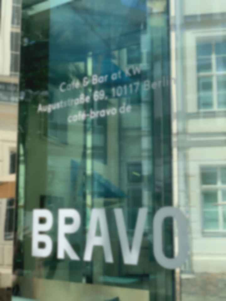
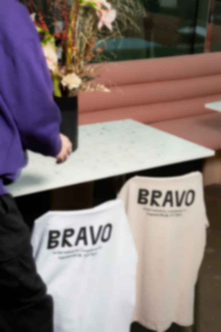
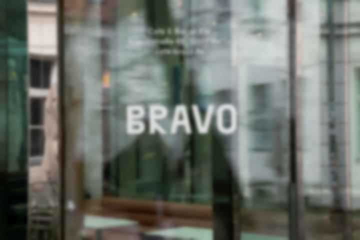
BRAVO Café & Bar – Design Identity
KW Institute for Contemporary Art has settled in an old margarine factory, which features the courtyard BRAVO Café & Bar, based on an idea of American artist Dan Graham and realized with the Architect Johanne Nalbach, opening in September 1999.
The composition, hastily sketched by the artist and faxed to Berlin, is a work of art in itself, knowing how to confuse, distract and delight the senses with distorted, mirrored, refracted images.
We carefully corresponded all visual communication design to the interieur concept by SUPERSUPPLY, playing with mirroring effects, unusual typeface and aligned colours and developed website and social media presence. Our approach was to create a subtle simplicity leaving room for the extraordinary setting with paying tribute to the iconic café that, just like KW, has become an institution on the Berlin art scene.
Client: Supersupply
Berlin, 2020
#000000

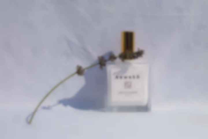
Art Direction for KEWEKŌ natural skincare
As creative consultant Denise directs the visual identity for London-based brand Kewekō Skincare, working in close collaboration with the client, international renowned Make-Up artist Kerstin Weller.
Every aspect of Kewekō´s line of natural products is well-considered, from the elegant, sustainable glass packaging to the organic ingredients. All of the packaging is biodegradable and can be easily recycled from the glass to the cardboards and papers.
Denise provided graphic and consultancy services for the female run company as well as brand identity, packaging, content creation, design and e-marketing solutions.
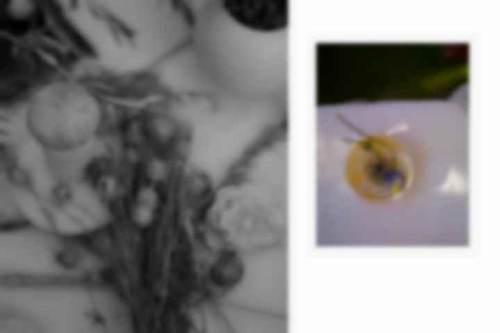
A play with shadow and light. Captured by Denise Amann, Nora Erdle & photographer Stefan Milev, Stuttgart, 2019
Client: Kerstin Weller
London, 2019
#000000

Art Direction for KEWEKŌ natural skincare
As creative consultant Denise directs the visual identity for London-based brand Kewekō Skincare, working in close collaboration with the client, international renowned Make-Up artist Kerstin Weller.
Every aspect of Kewekō´s line of natural products is well-considered, from the elegant, sustainable glass packaging to the organic ingredients. All of the packaging is biodegradable and can be easily recycled from the glass to the cardboards and papers.
Denise provided graphic and consultancy services for the female run company as well as brand identity, packaging, content creation, design and e-marketing solutions.
A play with shadow and light. Captured by Denise Amann, Nora Erdle & photographer Stefan Milev, Stuttgart, 2019
Client: Kerstin Weller
London, 2019
#000000
Art Direction for KEWEKŌ, natural skincare
As creative consultant Denise directs the visual identity for London-based brand Kewekō natural skincare, working in close collaboration with the client, international renowned Make-Up artist Kerstin Weller.
Every aspect of Kewekō´s line of natural products is well-considered, from the elegant, sustainable glass packaging to the organic ingredients. All of the packaging is biodegradable and can be easily recycled from the glass to the cardboards and papers.
Denise provided graphic and consultancy services as well as brand identity, packaging, content creation, design and e-marketing solutions.
Client: Kerstin Weller
London, 2019
#000000
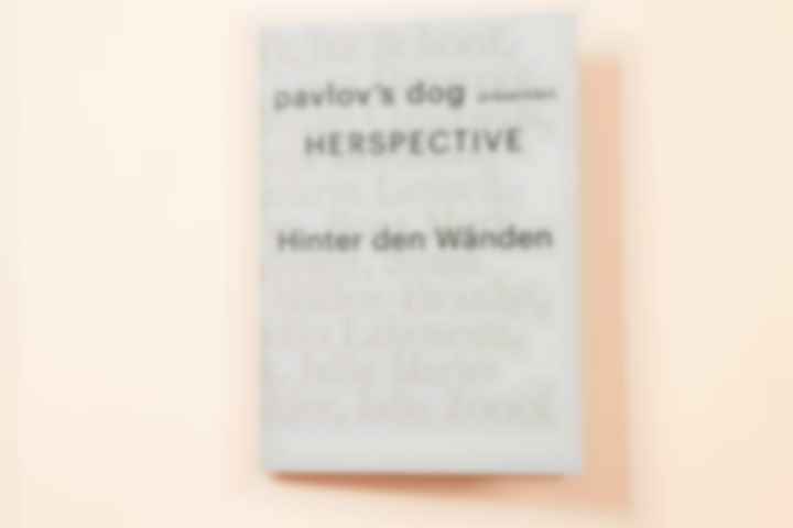
HERSPECTIVE – Design – Artist Catalog
"Behind the Walls," the artist catalog presented by HERSPECTIVE at PopKudamm for eMOP 2023, in collaboration with pavlov's dog gallery – curated by Michael Biedowicz & Katharina Alba.
As the Designer, Ellen curated the typeface AlienorDisplay-Ligh, crafted by French designers Anne-Dauphine Borione (Daytona Mess) and Lou Rainald. This unique font, available through Solitype, supports EU refugee initiatives, specifically aiding the "Solidarity with Refugees in Libya" project.
Ellens choice of Alienor represents more than design – it's a deliberate support for vital humanitarian causes.
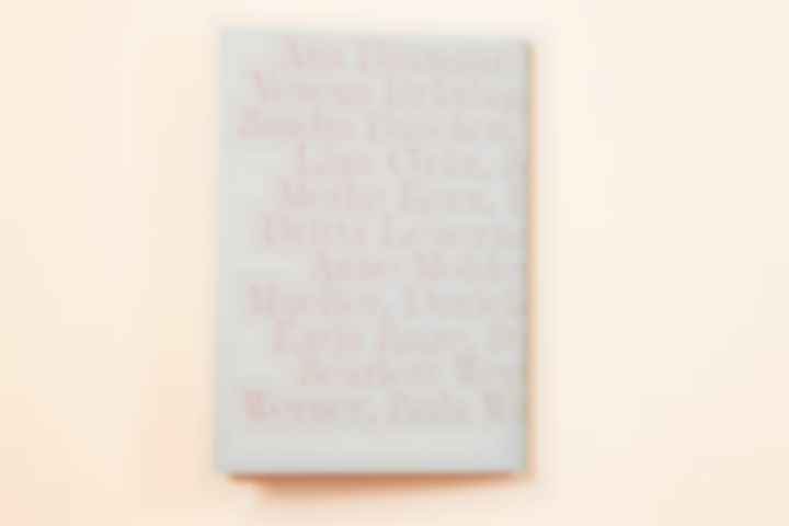
Participating artists:
Baumgart & Ina Schoof, Verena Brüning, Lena Burmann, Sandra Buschow, Janine Graubaum, Lina Grün, Sonja Hofmann, Meike Kenn, Kathrin Leisch, Britta Leuermann, Rosa Merk, Anne Moldenhauer, Daniela Müller-Brunke, Sonja Müller, Katja Ruge, Studio Likeness (Julia Classen & Magdalena Lepka), Julia Marie Werner, Scarlett Werth, Paula Winkler, Julia Zoooi
HERSPECTIVE – Design – Artist Catalog
Curation: Michael Biedowicz
Client: HERSPECTIVE
Berlin, 2023
#000000
HERSPECTIVE – Design – Artist Catalog
"Behind the Walls," the artist catalog presented by HERSPECTIVE at PopKudamm for eMOP 2023, in collaboration with pavlov's dog gallery – curated by Michael Biedowicz & Katharina Alba.
As the Designer, Ellen curated the typeface AlienorDisplay-Ligh, crafted by French designers Anne-Dauphine Borione (Daytona Mess) and Lou Rainald. This unique font, available through Solitype, supports EU refugee initiatives, specifically aiding the "Solidarity with Refugees in Libya" project.
Ellens choice of Alienor represents more than design – it's a deliberate support for vital humanitarian causes.
Participating artists:
Baumgart & Ina Schoof, Verena Brüning, Lena Burmann, Sandra Buschow, Janine Graubaum, Lina Grün, Sonja Hofmann, Meike Kenn, Kathrin Leisch, Britta Leuermann, Rosa Merk, Anne Moldenhauer, Daniela Müller-Brunke, Sonja Müller, Katja Ruge, Studio Likeness (Julia Classen & Magdalena Lepka), Julia Marie Werner, Scarlett Werth, Paula Winkler, Julia Zoooi
HERSPECTIVE – Design – Artist Catalog
Curation: Michael Biedowicz
Client: HERSPECTIVE
Berlin, 2023
#000000
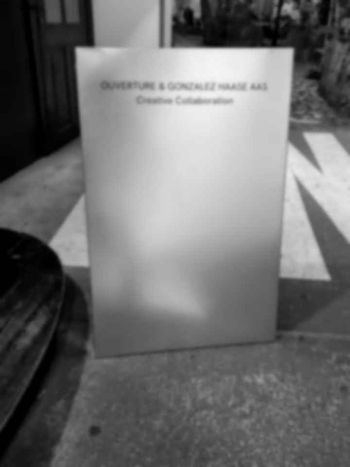
Visual communication for the OUVERTURE x GONZALEZ HAASE event in our beautiful OFFICINA Office
In October 2023, our OFFICINA Office in Berlin became the captivating backdrop where OUVERTURE x GONZALEZ HAASE celebrated their creative collaboration.
Ellen designed the visual communication of the event and the exquisite OUVERTURE Fall 23 fine jewelry collection, shaping the event's visual story.
This event fused artistic finesse with elegance, offering a compelling showcase of their collaborative brilliance. It was an honor to collaborate with Kris Ter-Ghazaryan, the remarkable founder of OUVERTURE, and to contribute creatively to the visual storytelling of such a prestigious event and collection.
Art direction for the OUVERTURE x GONZALEZ HAASE event
Client: Kris Ter-Ghazaryan, OUVERTURE
Berlin, 2023
Photos: Frederik Zieher
#b3b3b3
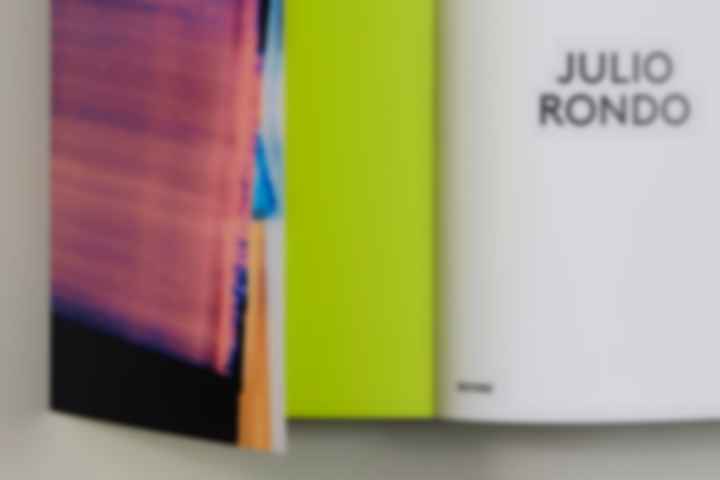
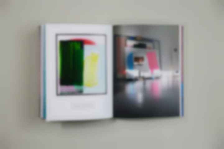
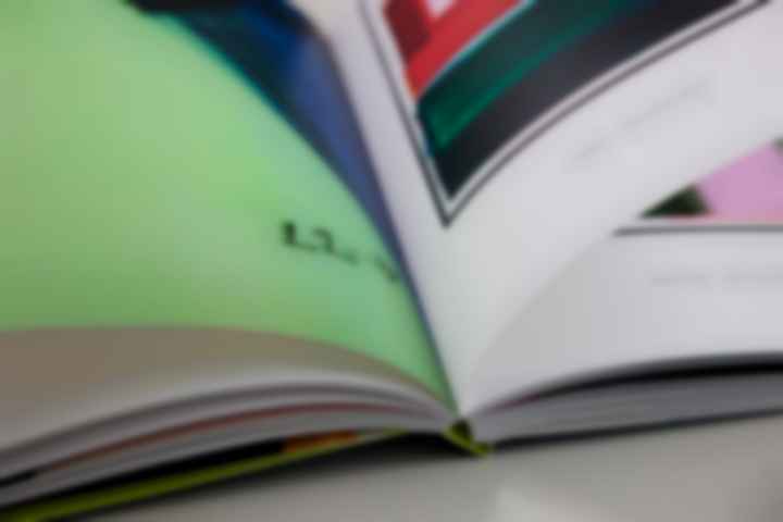
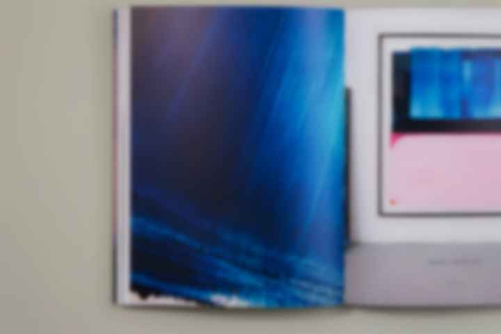
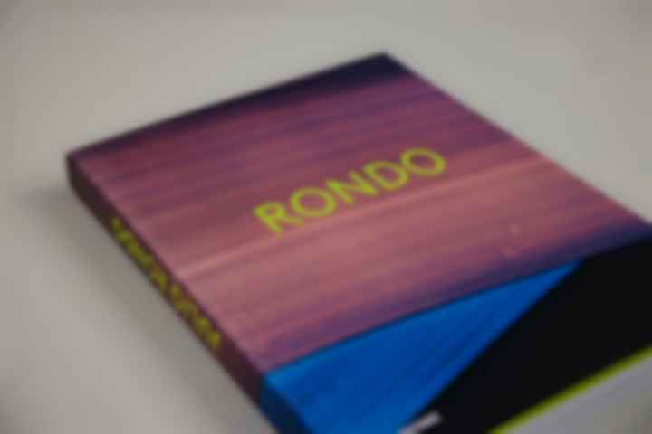
RONDO – Art Direction – Artist Catalog
Published in 2021, the catalog RONDO is a retrospective of artist Julio Rondo‘s work from 2016 to the present. RONDO has been released on occasion of the exhibition GOING SOUTH at Galerie Andreas Binder, Munich in 2021.
„For me, Julio Rondo‘s paintings are colour-architecure (...) He is preoccupied with colour space: not a two-dimensional imulated space – as is often found in the history of painting – but a space that can be experienced in real terms.“ Philipp Bollmann
Via Rondos choosen material: glass, the viewer is allowed to dive into the deep-set, earlier layers of paint and color. Further, Rondo‘s painting sharpens the viewer‘s eye to the technique of paint application itself and opens up deep spatial dimensions.
These characteristic elements of Rondos work guided the Art Work for the visual conception of RONDO. We picked the powerful vibration of his work and transferred it into a neon-colored title on the cover. The technical sophistication of the brushstrokes is accounted for with detail shots and close-ups.
„We can actually walk through his works spatially with our eyes and thoughts.“ Philipp Bollmann
RONDO – Art Direction – Artist Catalog
Image Editing: Tina Berning, Berlin
Production: Christiane Rothe / DruckConcept, Berlin
Publisher: Distanz Verlag, Berlin
Client: Galerie Binder, Munich
Berlin / Munich, 2021
#000000
RONDO – Art Direction – Artist Catalog
Published in 2021, the catalog RONDO is a retrospective of artist Julio Rondo‘s work from 2016 to the present. RONDO has been released on occasion of the exhibition GOING SOUTH at Galerie Andreas Binder, Munich in 2021.
„For me, Julio Rondo‘s paintings are colour-architecure (...) He is preoccupied with colour space: not a two-dimensional imulated space – as is often found in the history of painting – but a space that can be experienced in real terms.“ Philipp Bollmann
Via Rondos choosen material: glass, the viewer is allowed to dive into the deep-set, earlier layers of paint and color. Further, Rondo‘s painting sharpens the viewer‘s eye to the technique of paint application itself and opens up deep spatial dimensions.
These characteristic elements of Rondos work guided the Art Work for the visual conception of RONDO. We picked the powerful vibration of his work and transferred it into a neon-colored title on the cover. The technical sophistication of the brushstrokes is accounted for with detail shots and close-ups.
„We can actually walk through his works spatially with our eyes and thoughts.“ Philipp Bollmann
RONDO – Art Direction – Artist Catalog
Image Editing: Tina Berning, Berlin
Production: Christiane Rothe / DruckConcept, Berlin
Publisher: Distanz Verlag, Berlin
Client: Galerie Binder, Munich
Berlin / Munich, 2021
#000000
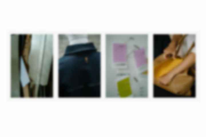
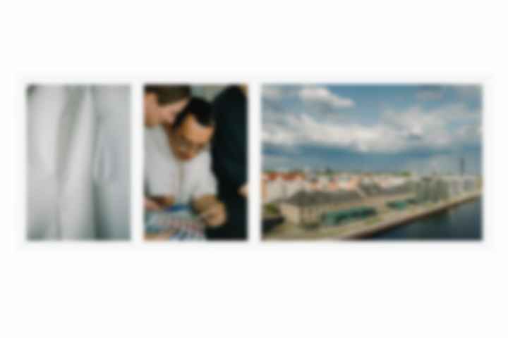
s.Oliver Group Relaunch – photo documentary with Oliver Helbig
In collaboration with the s.Oliver Group in 2021, Ellen directed a transformative relaunch project.
The primary goal was to craft a design that embodies the collective identity of the group while empowering each of its five distinct brands – s.Oliver, QS by s.Oliver, Comma, Liebeskind, Copenhagen Studio – to showcase their unique visual identities.
Alongside the design renewal, Ellen led content creation for the s.Oliver Group. Teaming up with photographers Oliver Helbig and Rainer Hosch, they captured the core spirit of the group. Helbig documented the group's activities, offering a glimpse into its vibrant culture, while Hosch portrayed employees in the poignant "Heart Workers" series.
These visual narratives now serve as pivotal components in the s.Oliver Group's employer branding efforts, offering authentic insights into their dynamic work environment and honoring the dedication of their diverse workforce.
The opportunity to craft a visual narrative that echoed the collective identity of brands of this magnitude was both an honor and a joy.
s.Oliver Group Relaunch
Group Identity Design
Content Creation
Employer Branding
Client: s.Oliver Group
Berlin & Rottendorf, 2022
#000000
Art Direction of VOW magazine issue #1 THIS MUST BE THE PLACE
Denise is founder, editor and art director of the independent thematic publication VOW Magazine. VOW is dealing with the subject of places and personal getaways, building islands within everyday life and ephemeral escapes from time and space, featuring critical and thoughtful essays, images, illustrations and reflections on subjects that impact us.
Berlin, since 2013
#000000
Art Direction of VOW magazine issue #2 UTOPIA
Denise is founder, editor and art director of the independent thematic publication VOW Magazine. VOW is dealing with the subject of places and personal getaways, building islands within everyday life and ephemeral escapes from time and space, featuring critical and thoughtful essays, images, illustrations and reflections on subjects that impact us.
Berlin, since 2013
#000000
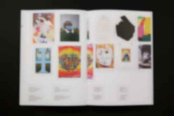
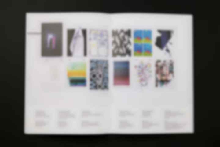
An intervention by artist Daniel Man - Art Direction, Exhibition Catalog
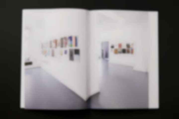
The exhibition project "Artists are not working FOR FREE" was initiated by British artist Daniel Man. The exhibition is to be read as a reaction to the conditions of art and culture professionals, which have been exacerbated by the pandemic. The concept of the show refers to democracy in general and solidarity among artists especially. The works of the 100 participating artists were shown in a non-hierarchical manner, every artist was given the same space. The project stands symbolically for the cohesion within the artist scene and for the attempt at a collective artistic inventory to overcome the pandemic. All commissions were fairly split in exact equal parts among all participating artists.
Ellen took Man´s attempt and translated the idea of non-hierarchy into the catalog format. One artist follows one another, same in size and in representation. The narrative order of the artworks was transferred from the exhibition rooms to paper. The typography of the catalog is also restrained. The idea of an equally open stage for art that has been pushed into the background by economic factors should by thus visually be made clear.
100 participating artists:
AKUT, Boban Andjelkovic, Robert Barta, Julia Benz, Benjamin Bergmann, Tina Berning, Kilian Blees, Katrin Blohmann, Martin Borowski , Johannes Brechter, Leon Buchner, Sebastian Bühler, Giovanni Castell , Roman Cherezov, Marc von Criegern, Jan Davidoff, Brad Downey, Hadrien Dussoix , Walter Eul, Johannes Evers, Martin Fengel, Knop Ferro, Roland Fischer, Philipp Frank, Tim Freiwald, Benedikt Gahl, Miriam Ganser, Patricija Gilyte, Sebastian Giussani, Ted Green, Michael Grudziecki, Jakob Hentze, Margarete Hentze, Benedikt Hipp, Annegret Hoch, Theo Hofmann, Michael Hofstetter, Stefan Hunstein, Endy Hupperich, Caro Jost, Izima Kaoru, Ina Kapitola, Johannes Kiel, Johannes Koch, Christofer Kochs, Anna Krammig, Schirin Kretschmann, Philipp Lachenmann, Lando, René Landspersky, Josef Lang, Roman Lang, Eugene Lemay, Stefan Lenhart, Christine Liebich, Kalin Lindena, Loomit, Timur Lukas, Sophia Mainka, Daniel Man, Nina Annabelle Märkl, Ruth Masso, Bernhard McQueen, Matthias Meyer, Judith Milberg, Ray Moore, Alex Müller, Daniel Müller-Schott, Adam Mysock, Christine Nguyen, Yigal Ozeri, Mara Pollak, Christian Probst, Esther Irina Pschibul, Cornelia Rapp, Dieter Rehm, Peter Reil, Felix Rodewaldt, Julio Rondo, Anni von Rudzinski, Laurentius Sauer, Axel Schmalschläger, Sophie Schmidt, Asja Schubert, Luzia Simons, Antje Sträter, Susanne Thiemann, Tomislav Topic, Leif Trenkler, Stefanie Ullmann, Magdalena Waller, Heike Weber, Thomas Weinberger, Felix Weinold, Stefan à Wengen, Paul Winstanley, Martin Wöhrl, Won, Wow123, Haiying Xu, Ian Zak, Andrius Zakarauskas, Yul Zeser, Bernd Zimmer, Stefanie Zoche
Art Direction, Exhibition Catalog & Visual Communication
Client: Galerie Binder
Munich, 2021
#ffffff
An intervention by artist Daniel Man - Art Direction, Exhibition Catalog
The exhibition project "Artists are not working FOR FREE" was initiated by British artist Daniel Man. The exhibition is to be read as a reaction to the conditions of art and culture professionals, which have been exacerbated by the pandemic. The concept of the show refers to democracy in general and solidarity among artists especially. The works of the 100 participating artists were shown in a non-hierarchical manner, every artist was given the same space. The project stands symbolically for the cohesion within the artist scene and for the attempt at a collective artistic inventory to overcome the pandemic. All commissions were fairly split in exact equal parts among all participating artists.
Ellen took Man´s attempt and translated the idea of non-hierarchy into the catalog format. One artist follows one another, same in size and in representation. The narrative order of the artworks was transferred from the exhibition rooms to paper. The typography of the catalog is also restrained. The idea of an equally open stage for art that has been pushed into the background by economic factors should by thus visually be made clear.
100 participating artists:
AKUT, Boban Andjelkovic, Robert Barta, Julia Benz, Benjamin Bergmann, Tina Berning, Kilian Blees, Katrin Blohmann, Martin Borowski , Johannes Brechter, Leon Buchner, Sebastian Bühler, Giovanni Castell , Roman Cherezov, Marc von Criegern, Jan Davidoff, Brad Downey, Hadrien Dussoix , Walter Eul, Johannes Evers, Martin Fengel, Knop Ferro, Roland Fischer, Philipp Frank, Tim Freiwald, Benedikt Gahl, Miriam Ganser, Patricija Gilyte, Sebastian Giussani, Ted Green, Michael Grudziecki, Jakob Hentze, Margarete Hentze, Benedikt Hipp, Annegret Hoch, Theo Hofmann, Michael Hofstetter, Stefan Hunstein, Endy Hupperich, Caro Jost, Izima Kaoru, Ina Kapitola, Johannes Kiel, Johannes Koch, Christofer Kochs, Anna Krammig, Schirin Kretschmann, Philipp Lachenmann, Lando, René Landspersky, Josef Lang, Roman Lang, Eugene Lemay, Stefan Lenhart, Christine Liebich, Kalin Lindena, Loomit, Timur Lukas, Sophia Mainka, Daniel Man, Nina Annabelle Märkl, Ruth Masso, Bernhard McQueen, Matthias Meyer, Judith Milberg, Ray Moore, Alex Müller, Daniel Müller-Schott, Adam Mysock, Christine Nguyen, Yigal Ozeri, Mara Pollak, Christian Probst, Esther Irina Pschibul, Cornelia Rapp, Dieter Rehm, Peter Reil, Felix Rodewaldt, Julio Rondo, Anni von Rudzinski, Laurentius Sauer, Axel Schmalschläger, Sophie Schmidt, Asja Schubert, Luzia Simons, Antje Sträter, Susanne Thiemann, Tomislav Topic, Leif Trenkler, Stefanie Ullmann, Magdalena Waller, Heike Weber, Thomas Weinberger, Felix Weinold, Stefan à Wengen, Paul Winstanley, Martin Wöhrl, Won, Wow123, Haiying Xu, Ian Zak, Andrius Zakarauskas, Yul Zeser, Bernd Zimmer, Stefanie Zoche
Art Direction, Exhibition Catalog & Visual Communication
Client: Galerie Binder
Munich, 2021
#ffffff

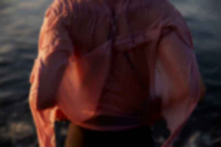
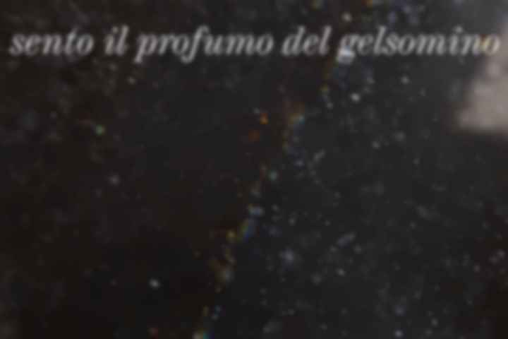
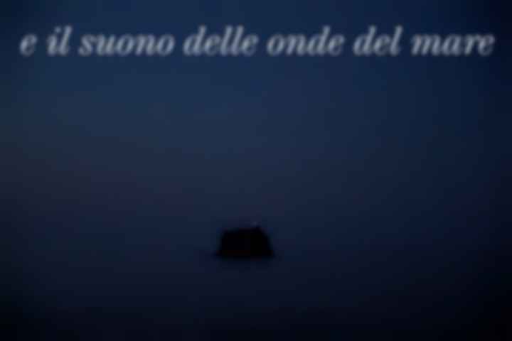
summer project
Sento il profumo del gelsomino e il suono delle onde del mare – captured by Ellen Goebel & photographer Ina Schoof
#000000
summer project
Sento il profumo del gelsomino e il suono delle onde del mare – captured by Ellen Goebel & photographer Ina Schoof
#000000

summer project
Sento il profumo del gelsomino e il suono delle onde del mare – captured by Ellen Goebel & photographer Ina Schoof
#000000
summer project
Sento il profumo del gelsomino e il suono delle onde del mare – captured by Ellen Goebel & photographer Ina Schoof
#000000
summer project
Sento il profumo del gelsomino e il suono delle onde del mare – captured by Ellen Goebel & photographer Ina Schoof
#000000